We design and print the best stationery, business cards, invitations, and more.

Learn more about the printing options:
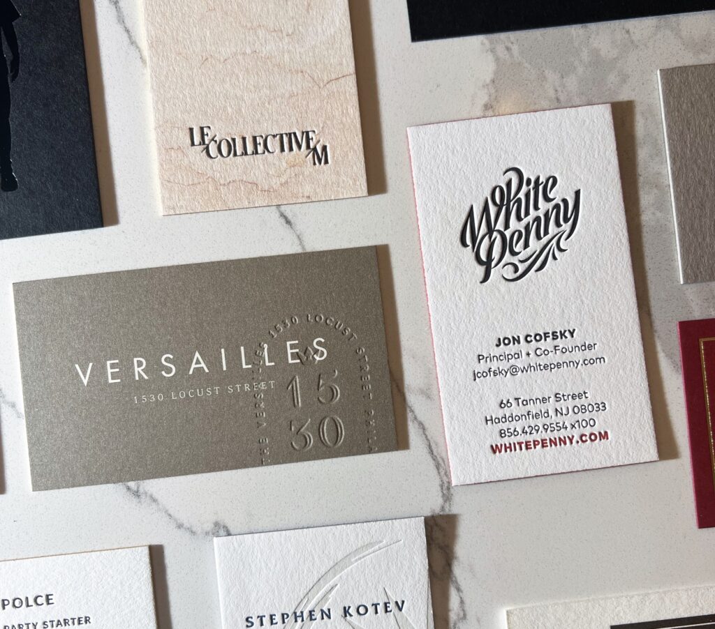
Letterpress
Soft cotton paper, rich tactile impression, hand done process. Letterpress is a one of a kind technique that we’ve mastered over the past 17 years.
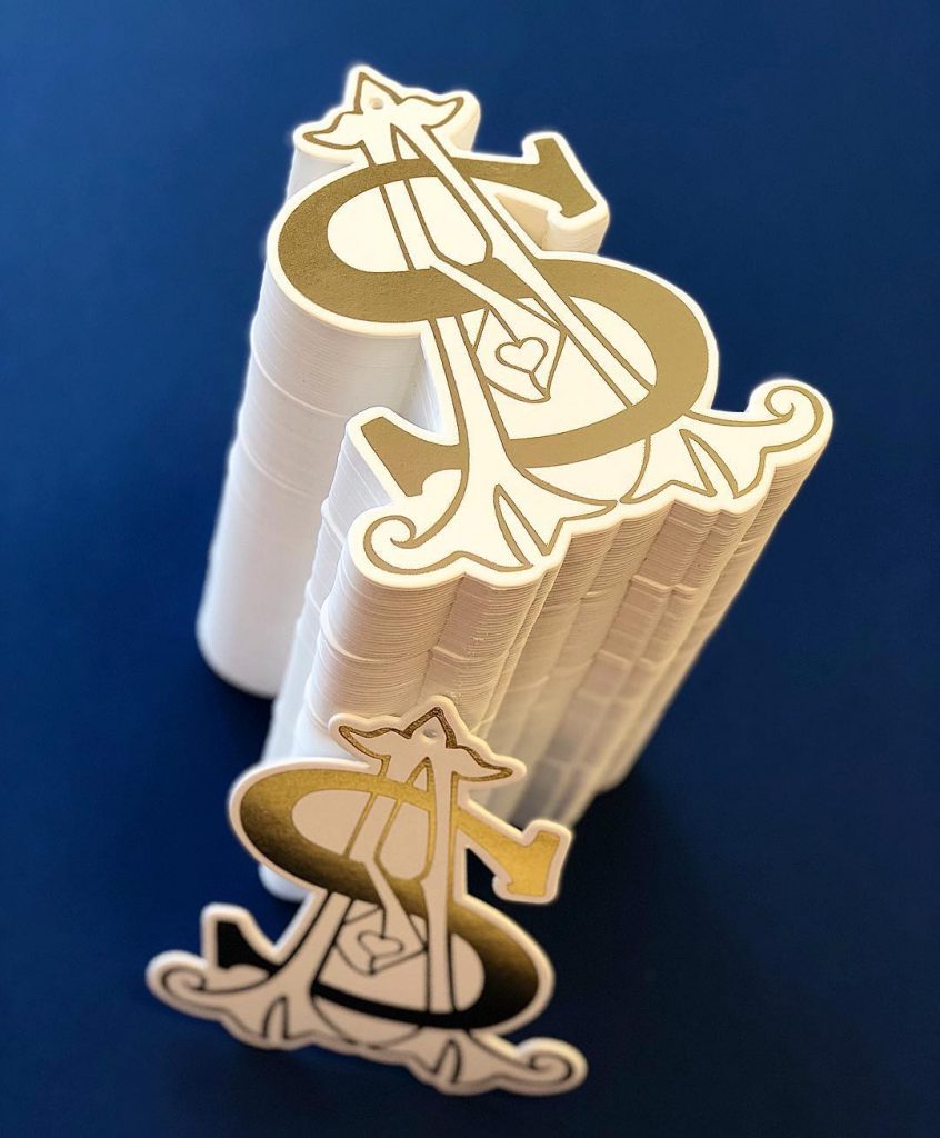
Foil Stamping
In addition to printing on dark stock with light colors, Foil Stamping enhances the print with metallic, glossy, holographic, and specialty finishes.
Digital Printing
With the ability to print in full color, Digital Printing is the best and most cost effective way to produce projects with multiple colors.
and more …
There are almost too many to list however other popular printing options include offset, thermography, and embossing. We also specialize in finishing including edge coloring, foil edging, die-cutting, and laser cutting.
Inquire about your project and we’ll help you pick the best options for your design + vision. Submit a request for quote here.
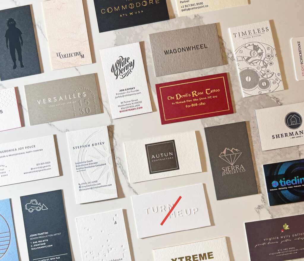
Our work speaks for itself.
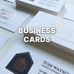
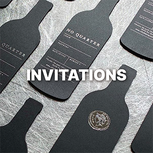
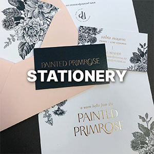
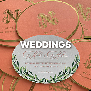
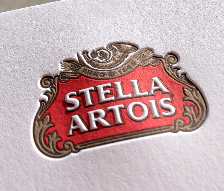
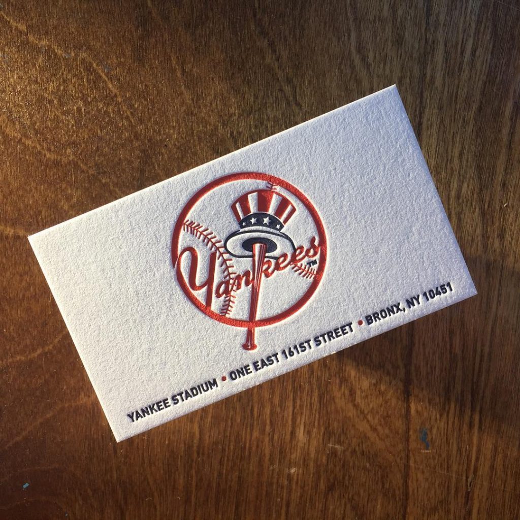
Look at some of our previous work and you’ll see why working with us will help make your project stand out. What do we print? We print anything on paper (plastic, wood, and metal too) from business cards and stationery sets, to invitations, stickers and packaging.


It’s all about the details.
We’re perfectionists. It’s why all of the design and printing is done in house by our amazing + talented team of artists. We pay attention to every detail and its why so many people trust us with their printing.
Whether it’s an invitation, stationery, business cards, or custom project we’ll help you from design to execution. You’ll work directly with one of our designers to conceptualize and perfect the artwork.
Once approved, our pressman will bring the art to life using the best combination of paper, printing, and finishing. Each print is carefully checked and reviewed at each step of the process.
Recent Projects & Updates
Learn more about our newest work, unique print + finish options, and other updates from the studio. We talk more in depth on the printing and finishing that goes into each piece, from business cards to notecards to invitations (and everything in between).
What are luxury business cards?
The Print Shop is now online

Heslington’s Luxury Stationery
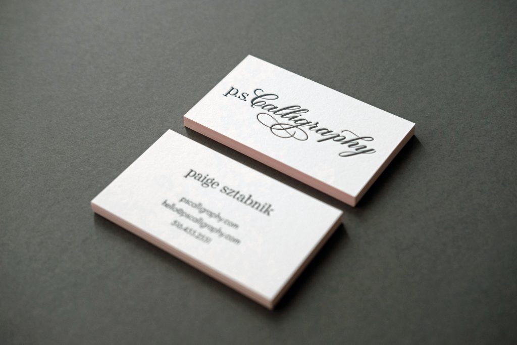
Letterpress Stationery for p.s. Calligraphy
Let’s talk.
Fill out the form or call the studio: 631.319.6639